 (I CAN'T PUT A REAL WORLD 'BORING PORTFOLIO WEBITE' IMAGE HERE BECAUSE I DON'T WANT TO RECEIVE BOMBS IN MY MAIL)
THE RESEARCH
I spent quite a bit of time researching developer portfolios that would inspire me in some way, but i found most of them to just not give me any feeling at all. A lot of them looked really similar and almost identical, and i didn’t want that… I knew i had to play it safe, but i didn’t want to give the feel of having designed my website copying a video tutorial on youtube. So i focused more on studying Graphic design. Which gave me a lot more insight on the possibilities of design, a better understanding of typography, design elements, and more. One type of design styles i stumbled upon, was Futuristic User Interfaces (or FUI for short). I honestly never paid too much attention to them in movies, probably because they were doing their job correctly. But looking at them with a critic eye in still images or loopable videos changed things. I was hooked, i loved that style. Of course, pure FUI as designed for movies would be the dumbest idea for a website in which every second of user interaction counts, and even a fly landing on a potential employer’s monitor could cost me a job opportunity. But i really wanted my digital identity to feature that ‘techy’, ‘futuristic’ feel i loved so much, especially since it fits my personality. So i tried my best to figure out how to make a usable FUI design for the web that would still respect most UX practices.
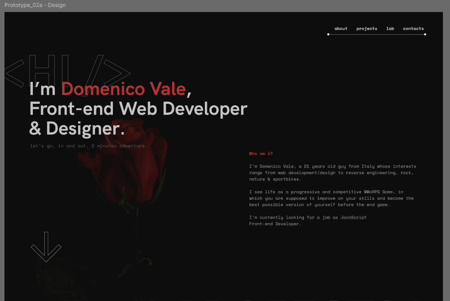 SEMI-FINAL PORTFOLIO DESIGN PROTOTYPE
THE DESIGN
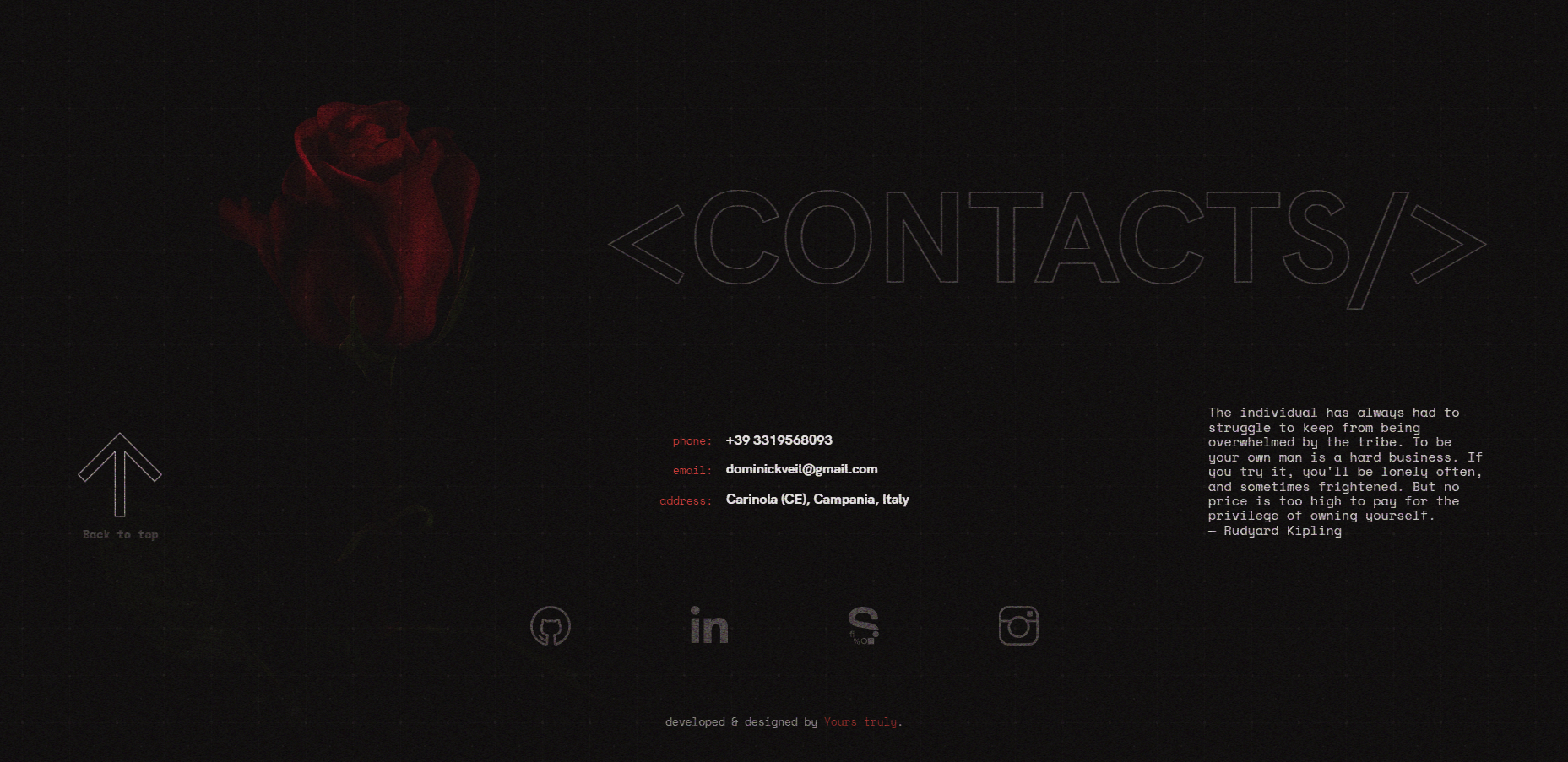
I wanted to go for a minimal, but still techy theme, with a dark color palette that featured warm colors, especially red. I wanted to convey a sense of confidence and elegance with the blacks, along with red, which would hint at my passion for art. Usually i go look for things that aren’t actual Graphic or Ui design pieces for inspiration. In this case i stumbled across this beautiful photo of a rose, which immediately gave me a few ideas. It was a perfect fit for me. Mixing nature and tech. Just like my average day.
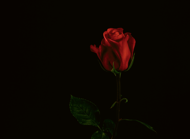
Of course, using pure black on a design almost never looks good, and would create too much contrast. So i chose a warmer shade of black. I initially put the rose on the hero section, but i thought it would distract too much, so i put it in the footer at the bottom.
Summing up my entire personality in as few lines of code felt kind of impossible, but i ended up with a good useful summary. On mobile it would become even more difficult but i chose to be lazy and add a read more button :P.
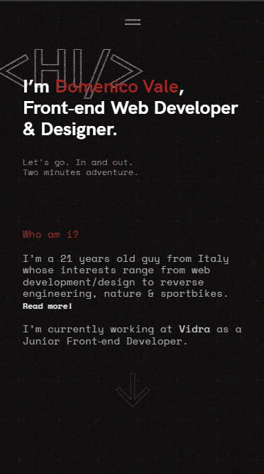
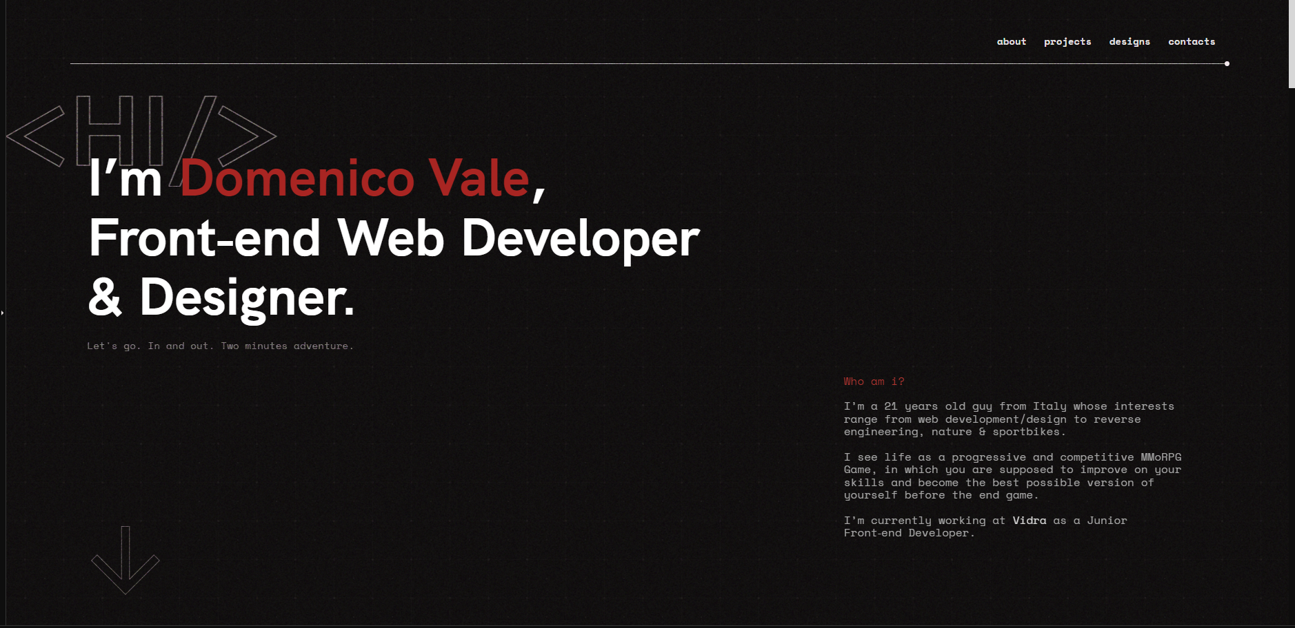
The hardest part was figuring out how to introduce the actual FUI elements. The first one i came up with, was a hint of an underline with dots. Super simple, but it already gave a bit of techy feel, reminding vaguely of circuit boards. The feeling was consolidated by outlined icons and the <Hi/> behind the hero header.
I wanted to showcase both my design projects and my development ones in different sections. For the development ones, i added frames around images and titles, used a table-like feel to the details, and a glitchy button with typical FUI stripes. As for the designs, i went for titles with big bold type, which would reveal images on hover and would follow the mouse (on mobile the images would be shown statically in the background)
 FINAL DESIGN FOR THE HOMEPAGE
FINAL DESIGN, DEVELOPMENT AND REFLECTIONS
To add to the FUI theme, i added a background grid, very common in FUIs, but lowered the opacity a lot to make sure that it wouldn’t distract. As for the animations, that was also kind of complicated. FUI animations are very flashy, very fast, and very distracting when you’re trying to read copy on the page. I still chose to use some strobe effects, but toned them down. I used sliding animations to change things up and differentiate them a bit. A background noise effect was added for texture. Personally, it gives me a weird but warm nostalgic feeling, almost like reading a HUD screen in space. But maybe it’s just me.
As for the development, Gatsby was going strong at the time, so i chose to try it out, i learned some basics of GraphQL (which was used for querying the images and lazy loading them, but honestly, i really didn’t like how i worked). I also learned about GSAP.
Overall, i could’ve improved it a lot, but one thing i learned very soon is that designing your own portfolio is an infinite task. You need to have the courage to just stop. You keep changing and having new ideas, what ifs and so on, especially if you have a perfectionist mind like me. Besides, as my first portfolio, i felt like it was good enough.